One of the greatest challenges in printing is matching colors. Whether you’re building a consistent brand or reproducing a wallpaper design, careful consideration must be given in order to achieve the desired results.
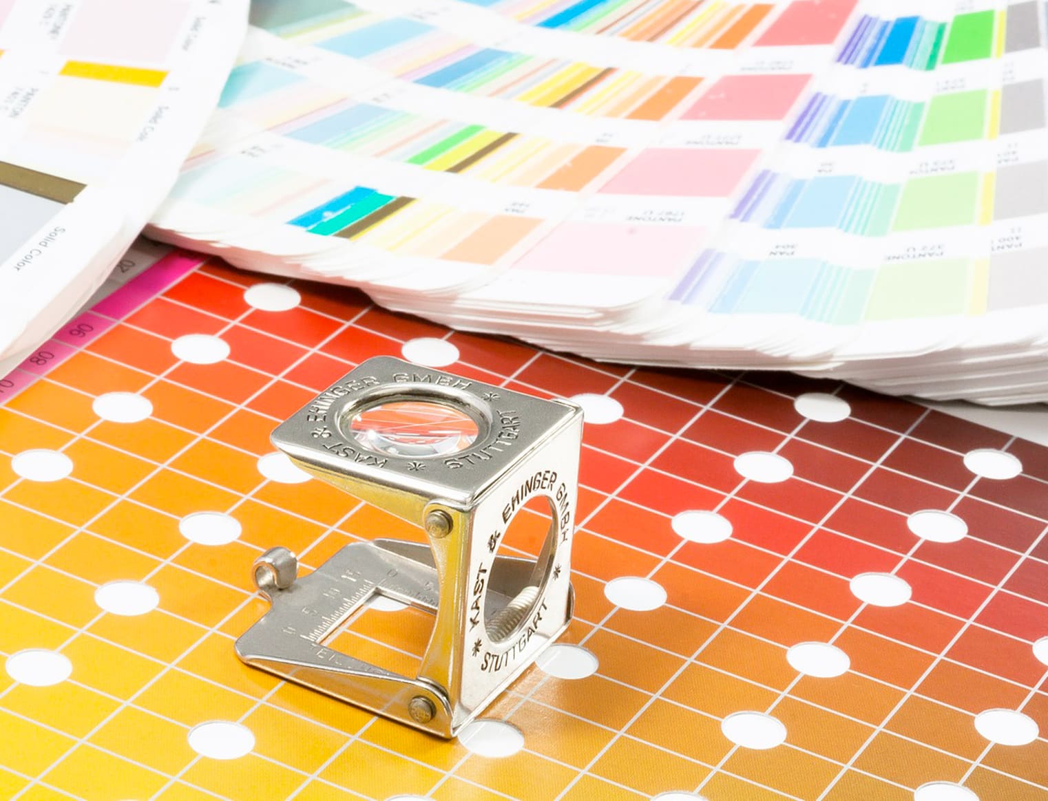
Thankfully there are a number of color systems available today which have standardized this process. Probably the most well known of these comes from Pantone. Founded in 1963, this company set the industry standard for color matching, allowing printers all over the world to deliver reliable results to designers and technicians.
More affordable options have also been made available to home owners and renovators thanks to paint companies like Benjamin Moore and Sherwin Williams and PPG Paints. These are also viable solutions that most printers can work with.
Any of these books present a great starting point for ensuring a solid color match. We say starting point, because there are always variables for printing colors - the lighting, stock, finish and texture of the paper can influence color in subtle ways. This is why we always recommend printing a sample proof and confirming color directly from press on the desired material, before printing up mass quantities.
How Lighting Affects Color Perception
We often think of colors in relative terms. As demonstrated below, Blue-Green looks more blue next to green and vice versa, it’s a trick the brain uses to help us put individual colors in their order. The same applies to other color combinations.

When a room is lit up photons of light bounce and refract off every surface. If it is lit by a flourescent bulb, the hues will be less pronounced and on the blueish side. Incandescent bulbs add a lot more warmth, yellows and oranges to the mix. Direct and indirect sunlight also change how we see color, adding far more saturation to the hues while washing out much of the lighter tones.
By tilting the color spectrum, the relationships between the colors are shifted. This is a relevant factor when reproducing vintage or out of print wallpaper patterns. We recommend using color books in all of these lighting situations, alongside a live sample. Take a picture of each lighting situation at different times of the day and night, then compare them afterwards. It can be surprising to see how differently color behaves under various conditions.
If you’d like a more in depth look at this phenomenon, Author Josef Albers wrote a groundbreaking book on this topic entitled “Interaction of Color”.
How Printing Materials Influence Color
Not every sheet of paper has the same grade of whiteness. Trace amounts of grays and yellows can significantly shift color perception. Coated vs uncoated materials can also make a color look warmer or cooler. For the best color match, always test a design on the desired stock since they don’t all react to ink the same way.
Color Matching for the Color Impaired
About 8% of men and 1% of women have some form of color impairment, where certain colors are transmitted to the brain differently. This can present unique challenges for many people, and we still have much to learn about it. Most of them lose the ability to distinguish between two certain colors, so the rest of their perception is in alignment with our consensus, and they can match most other colors with ease.

Given that color perception can be so unique and individual it is recommended to have multiple people participate in the matching process.
You can test your color perception at ColorBlindnessTest.org
Learn More About Color Blindness
A Brief History of Color Matching

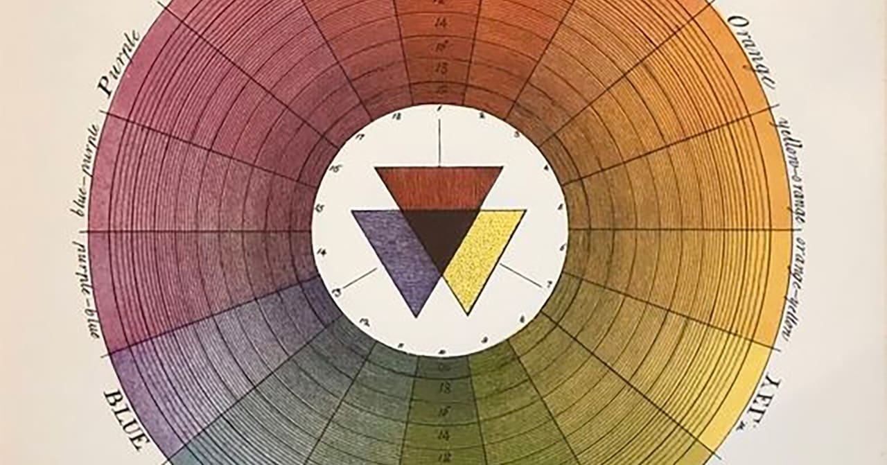
This artform goes back much farther than most people suspect. The earliest printed example comes from Dutch artist A. Boogert, who in 1692 published his book “Treatment of Colors Used for Water-Based Painting”. The book featured 900 pages of hand painted swatches, which included explanations of how much pigment and water to mix to achieve these exact colors. It was an ambitious project which demonstrates a real need for color consistency.
In 1875, Sherwin-Williams started selling ready-mixed paint. This was a huge innovation as previously, consumers were required to by paint ingredients that would need to be mixed together. This quickly became the industry standard where they dominated the market for decades.
In 1906 The Eagle Printing Ink Company demonstrated an ability to print a nearly unlimited range of colors by layering four inks: cyan, magenta, yellow and black. CMYK is still used by printshops all over the world to this day. It is the prevailing process in commercial printing due to its simplicity, low cost and flexibility.
In 1956, Lawrence Herbert was hired by M&J Advertising as a part-time employee. Color matching was his main responsibility, so Herbert used his chemistry knowledge to systematize and simplify the company’s stock of pigments and the production of colored inks. By 1962, Herbert was running the ink and printing division, eventually buying the owners out and renaming the company “Pantone” - a brand so respected by a multitud of industries that major brands like Coca Cola would adopt it as a standard, and many countries/states would choose official Pantone colors for their flags and emblems.
In 1982, paint company Benjamin Moore introduced one of the industry’s first-ever computerized color-matching systems, expanding color choice beyond color chips and allowing retailers to match the color of any sample from any location.
In 1988 Apple introduced ColorSync - a set of proprietary algorithms for synchronizing computer screens with home printers. This software would eventually find its way to Windows and become a staple of desktop publishing.
In 1992, Benjamin Moore opened a research and development facility on 90 acres in Flanders, N.J., including a five-acre outdoor test farm housing more than 2,500 test boards of more than 70 different substrate types, systematically coated with both proprietary and competitor products for long-term, brand-blind observation.
In 1993 The International Color Consortium (ICC) was formed by eight vendors in order to create an open, vendor-neutral color management system which would function transparently across all operating systems and software packages. This became the operating standard for synchroning peripheral devices, including scanners and printers. This effort was funded by Adobe, Agfa, Apple, Kodak, Microsoft, Silicon Graphics, Sun Microsystems, and Taligent.
Summary
Color matching is a highly technical process with a rich history, but it doesn’t need to be complicated. Today we have more tools than ever which achieve commercial-grade results with minimal effort. In order to take full advantage of this convenience, it is helpful to understand a few fundamental ideas of how color works and how we draw our comparisons. Having multiple points of reference and multiple sets of eyes on a problem are also instrumental in finding the perfect match.
For mission critical printing applications, it is highly recommended to review a press sample in-hand, using the desired stock along with the above methods before going into production.
We hope you’ve found this information useful. If you have and questions about color matching we’ll be glad to answer them at inquiries@fineprintnyc.com or (212) 619-5446.

