Design Tips
Getting Started
When setting up a document for print, it is important to understand certain guidelines that help achieve consistency with sizing and color.
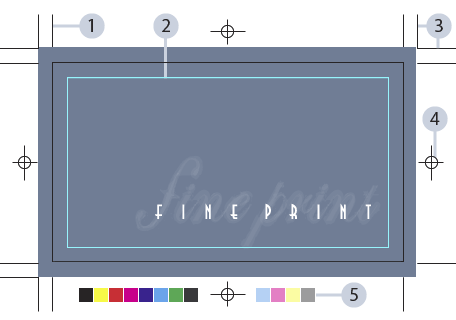
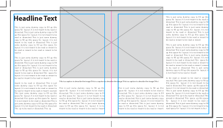
- Trim Size: The actual size that your print will end up – these crop marks indicate the final cut.
- Live Area: Serves as a guide to keep important text/images from getting too close to the trim line.
- Bleed Size: For layouts where an image is meant to spill off the page, an extra margin is made around your piece to ensure that, even if the cut is off by a hair, your image still extends to the very edge of the trim line.
- Registration Mark: Helps keep the printed colors in alignment with each other.
- Color Bars: A very helpful tool for printers to calibrate color/ink settings.
NOTE: It is crucial to make sure all markings are filled with registration black (100% of all process colors) in order to keep colors aligned.
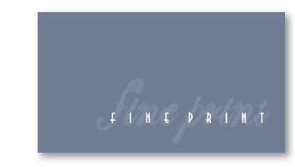
Once it goes to print and is trimmed down, the finished product will look like this:
It is worth noting that you don’t have to create any of these markings yourself. These guides caneasily be configured in the Print dialogue box:
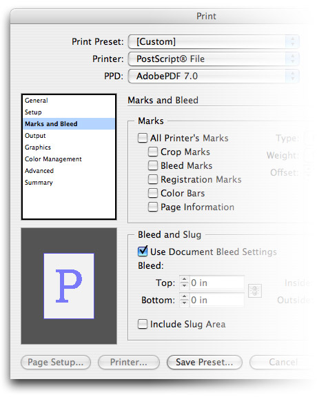
Although this is an automatic feature, having a working knowledge of these standards will help you set up your documents properly from the start.
Just remember to set the document size to your trim size and your margin size should represent your live area (anywhere from 0.125” – 0.25” depending on the application).
Layout & Prepress


Quark XPress has long been the industry standard for prepress, but Indesign has been gaining popularity with tons of innovative features and seemless integration with other Adobe applications. Both programs are perfectly capable for the task of prepress layout.
Multi-Page Documents
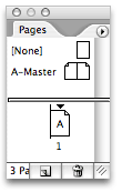
Laying out multiple pages is a snap with Quark or Indesign. Just open up your Pages palette (menu Window / Pages) and you can quickly add or delete pages by clicking the icons at the bottom.
In order to view or edit a page, simple double click it and the screen will jump right to that specified page. You can also re-arrange the order of the pages by clicking and dragging them around.
Spreads
Spreads refer to two pages facing each other with a common gutter. Reader’s spreads are set up the way that you would read a book: pages 2 and 3 would be a spread; 4 and 5, etc. Printers spreads are organized for printing signatures. For example, if you have a 8 page booklet, page 8 and 1 would be a spread; 2 and 7; 6 and 3; etc.
If you have items on the page that you want to extend into the next page, it is called a “crossover”. You should be very careful when working with a crossover. If facing pages are printed on different sheets, it may be difficult to keep the color and alignment consistent between the pages when printed at a press.
Another consideration for spreads is the extra gutter space in the middle which accounts for the extra paper used during the binding process. These center gutters vary greatly within different applications, so it’s best to consult your printing service bureau for specifications on a given project.
Handling Images
Quark and Indesign both enable you to import various image formats, though only two are truly recommended for print layout.

EPS or (Encapsulated Postscript) is a format used for any vector artwork, (Illustrator, Freehand, etc.) or even a bitmap image with a clipping mask, since the mask is drawn using vectors.

TIFF (Tagged Image File Format) is a format exclusive to raster images. Unlike other image formats, TIFFs will allow you to colorize a black and white image directly from the layout application.
There are a few common mistakes that the untrained will make when dealing with images in a layout program.
- Assuming that images are saved directly inside a Quark or Indesign document.
- Importing an image, then increasing the size by too much without considering the resolution.
- Working with RGB files instead of CMYK.
The first one is probably the most common error. To the uninitiated, it appears that the software is storing the images right into the document, but this simply isn’t the case.
If you were to move the referenced image to a different folder, then it would turn up missing in your program. This is why it is good practice to keep all of your imported images within one central folder.
We will cover the concepts of vectors, rasters and resolution in greater detail later in this tutorial.
Typography & Fonts
Description
A font is traditionally known as a complete set of all the letters of the alphabet, including associated numerals, punctuation marks, and any other symbols. Every font has a name, such as Goudy or Helvetica.
A family is a set of fonts related to the basic typeface which may include italic, bold, and bold-italic plus several different weights and widths.
The two main font standards are Adobe PostScript Type 1 and TrueType. Choosing which type to use is a very important decision. It is a good idea to choose one type and stay with it. Do not mix PostScript with TrueType. Some typefaces are available in both, but the visual characteristics of one font standard differs slightly from another.
Font Styles
Different styles of typography can usually be broken down into a few simple categories once you learn to recognize certain characteristics of lettering. Consider the following examples:

These are the most common font styles. A typography enthusiast would undoubtedly break this up into even smaller categories to reflect specific styles such as Art Deco, Retro, Western, Grunge etc.
Font Resources
Your system will undoubtedly have some fonts pre-installed, but there is only so much mileage you can get out of them. At some point you will need to build a decent collection of fonts. The following are some of the top resources on the web for finding good typefaces:
Commercial Fonts
Free Fonts
Font Management
Before you can use fonts within your graphics programs, you will need to activate them with a third-party application such as Extensis Suitcase or FontExplorer. Mac OS X comes bundles with Font Book. Any of these programs is perfectly capable of managing large amounts of fonts.
NOTE: If you are new to all this you may be wondering why you can’t just load all your fonts at once. This is not recommended as too many fonts will hog up your system memory and compromise your performance. It is better to have a minimal amount of fonts installed, activating/deactivating groups of them whenever the need arises.
Type-Setting
Once you have chosen a font to work with, it’s time to learn how to manipulate typefaces within a layout.
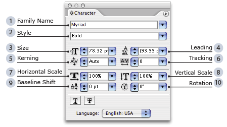
- Family Name: Displays the name of a font. Also lists all fonts installed.
- Style: Bold, italic or any other variations can be found here.
- Size: Fonts are measured in points, a unit which equals 1/72 inch.
- Kerning: The space between individual characters.
- Tracking: The space between a selected group of characters.
- Leading: The vertical space between line breaks.
- Horizontal Scale: Change width of letters.
- Vertical Scale: Change height of letters.
- Baseline Shift: Raise or lower characters relative to the baseline.
- Rotation: Alter the axis of fonts by varying degrees.
Raster Graphics
 Photoshop
 Gimp](http://www.gimp.org/)
Photoshop stands in a class by itself in the world of digital imagery. It is THE standard tool for photo retouching and is the basis for this tutorial.
Gimp, while not as full-featured is also a very powerful tool for manipulating images and also happens to be free, open source software.
Description
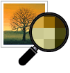
Raster Images are composed of pixels, or small colored boxes which trick the eye into seeing smooth colors. Take a look at the following picture.
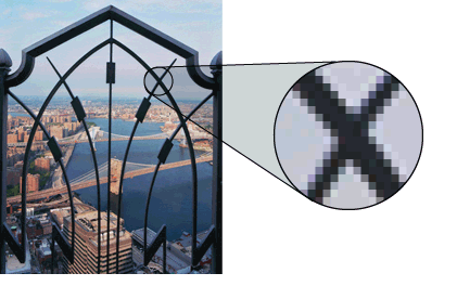
When viewed at it’s display size, the image appears flawless and photographic. But zoom into it far enough you start to see the grid-like mosaic of pixels that builds raster images. The quality of the image can be measured by its resolution.
Applications
Pixel-based imagery works particularly well for photographs, illustrations and 3D models. It is ideal for these mediums since it will render with photographic precision anything you can throw at it.
On the other hand, raster is not the best format to use for typography. Programs like Quark, Indesign and Illustrator use a far-superior technology (Postscript) which guarantees the crispest and most legible text. Logos or any other sharp graphics are better served as vectors, which we will discuss at length later on.
Setting the Resolution
It is vital to have a clear grasp of what resolution is and how to set it properly, in order to print the cleanest and sharpest images possible.
Resolution is measured by PPI (pixels per inch). To set the proper resolution, you must first determine what the actual print size of the image will be so you can set the width and height, then set the resolution to a minimum of 300-400 PPI.
Images downloaded from the internet are usually set to 72 ppi, making them unsuitable for print. If you are looking for hi-resolution images, then you should consider purchasing them from online stock houses such as Corbis, Getty Images or Comstock.
NOTE: It is impossible to add higher resolution to an image. Turning a 72 PPI image into 300 PPI will do nothing for you except bloat your file size. This is why it is important to scan or shoot your images at the maximum possible resolution, then downsize from there.
Bitmapped vs Anti-Aliased Images
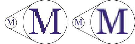
The image on the left is bitmapped, meaning that it is comprised of only two colors. The image on the right is anti-aliased which uses multiple colored pixels to create the illusion of smooth lines. You will see these terms used mainly to describe text renderings, but it also applies to selections.
Layers
If you only wish to modify part of your image, then you may simply select an area and apply your changes. However, this greatly restricts your flexibility. It would be wiser to select the area, then copy and paste it.
This will create a new layer within your document, which will show up in your Layers palette (menu Windows / Layers) For simple adjustments, only a few layers are usually necessary. For complex retouching jobs, there is virtually no limit to the amount of layers you may use.
At the top of your Layers palette you should see some standard controls:
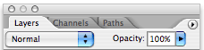
On the right is where you control the opacity, or transparency of the layers.
The left menu shows the available blend modes. These modes will filter out shades, tones, colors and lightness of your currently selected layer in relation to the layers underneath it. Play around with these values and you will quickly get a feel for what they do.
NOTE: Layers can add significantly to your file size, so it is usually good practice to save your original file as Photoshop (PSD) and when you wish to import it into another program, save a flattened copy in the appropriate format.
Vector Graphics
As opposed to raster graphics which are built on pixels, vector graphics (also called geometric modeling or object-oriented graphics) are composed of geometrical equations which map points, lines, curves, and polygons in order to represent images.
Since vectors are a resolution-independent graphics format and no pixels are involved, they can be printed at any size without any loss of image quality. Due to this razor-sharp precision, vectors are the medium of choice for logos, lettering, clip art and even full-blown illustrations.
Anatomy of Vector Shapes
Vectors are built up of anchor points and paths.

If you select the pen tool  you can create points by clicking around. Paths will connect all the points you make until you either close off your shape, or deselect it and start a new one.
In order to create bezier curves with vectors you simply click and drag with the pen tool. You will notice some extra handles appear and follow the direction of your mouse. These handles symbolize the strength, or influence of your curves.
As you can see, the pen tool is ideal for creating very precise, geometric shapes. However, if you want to create more organic forms with freestyle stroke then use the pencil  .
.
Vector Layers
Although there is a layers palette in Illustrator, it helps to think of all your objects as layers. They are like cut-out pieces of paper which you overlap to build an image. The first shape you created is at the bottom of the pile and the most recent one is at the top.
The Layers palette itself is best reserved for grouping related content. For example you may want to put a series of shapes or gradients on the first layer and then press the lock icon next to it. This will keep you from accidentally selecting the background as you build on top.
The next layer could be all text, the next logos, etc. Keeping your designs modular like this makes it much easier (and faster) for you to design layouts. Using many layers, gradients and blends, one can get almost photorealistic effect with illustrator.
Embedded vs. Linked Images
Illustrator will allow you to embed artwork directly into your file. This is not an advisable practice as it will inflate your file size to the extreme. You are better off importing linked images, and just having your vector program reference an external file, rather than embed directly.
Summary
You have just taken a crash course in several programs which work in tandem to produce printing applications. We have focused on Adobe products due to their seamless integration and user-friendliness. In this chapter you have learned:
- The basics of print markings and dimensions
- How to set up pages and spreads
- How to manage images and fonts
- How to create/edit raster and vector artwork
We have covered many angles here, but there is much more that each of these programs has to offer and you are encouraged to explore them yourself while taking advantage of the tutorial links provided at the start of this chapter.